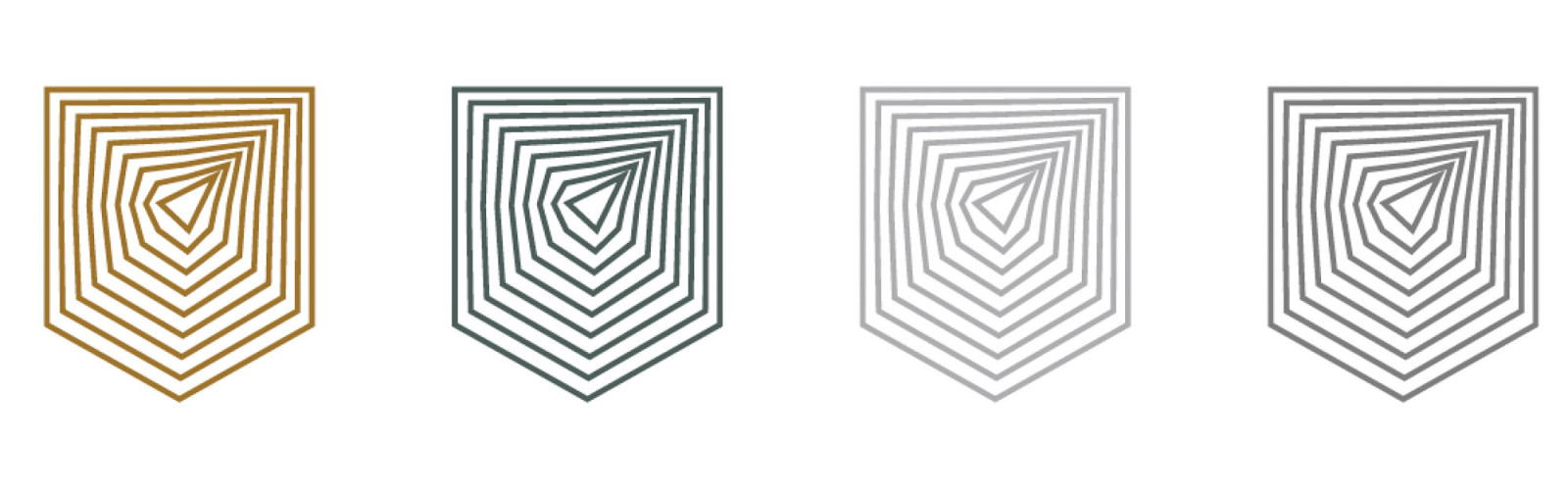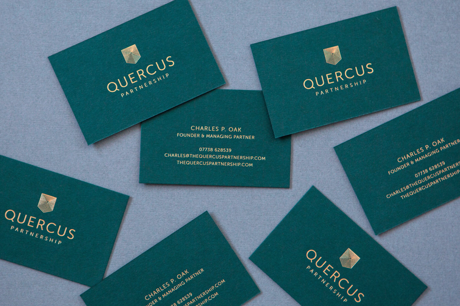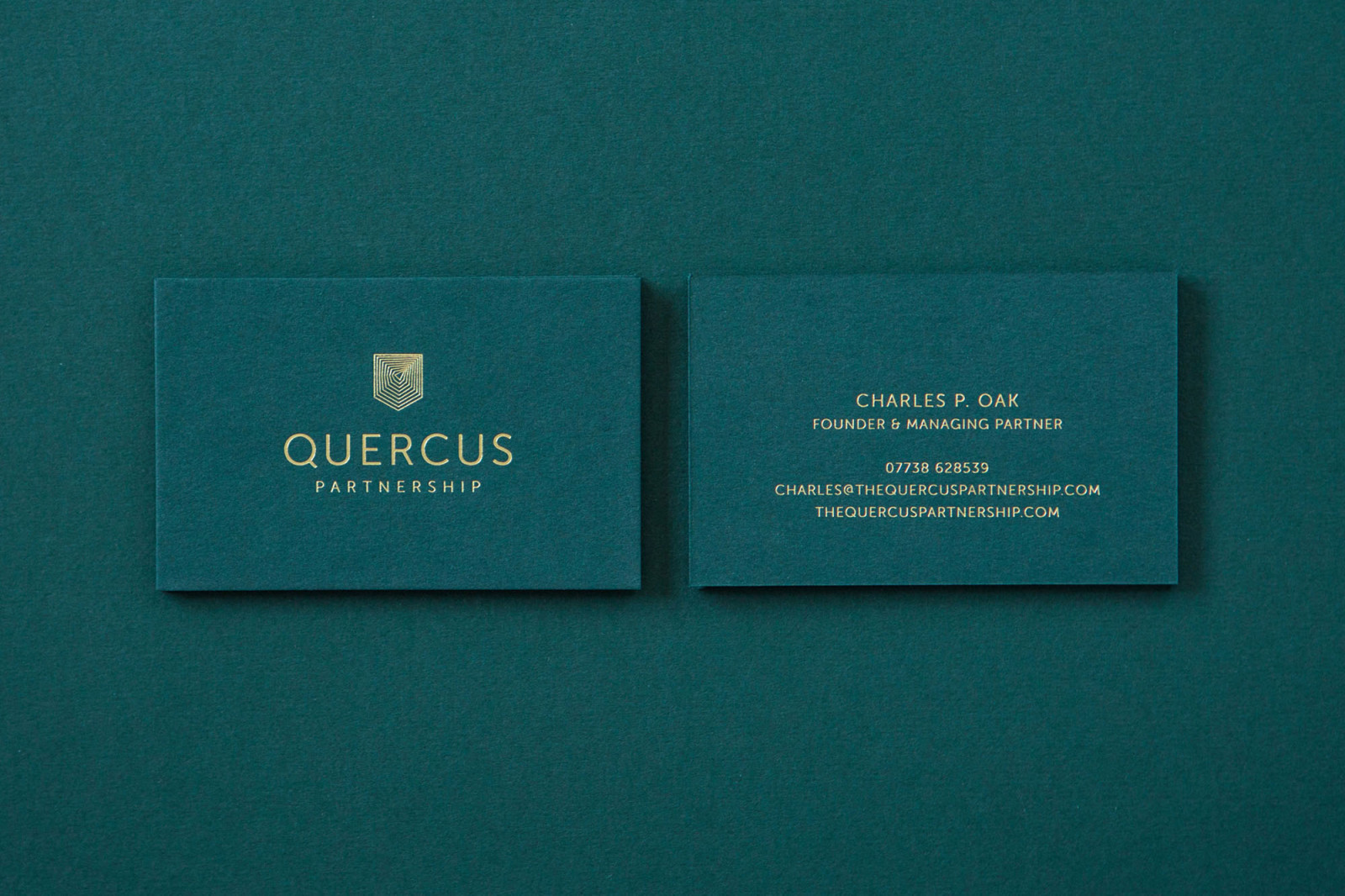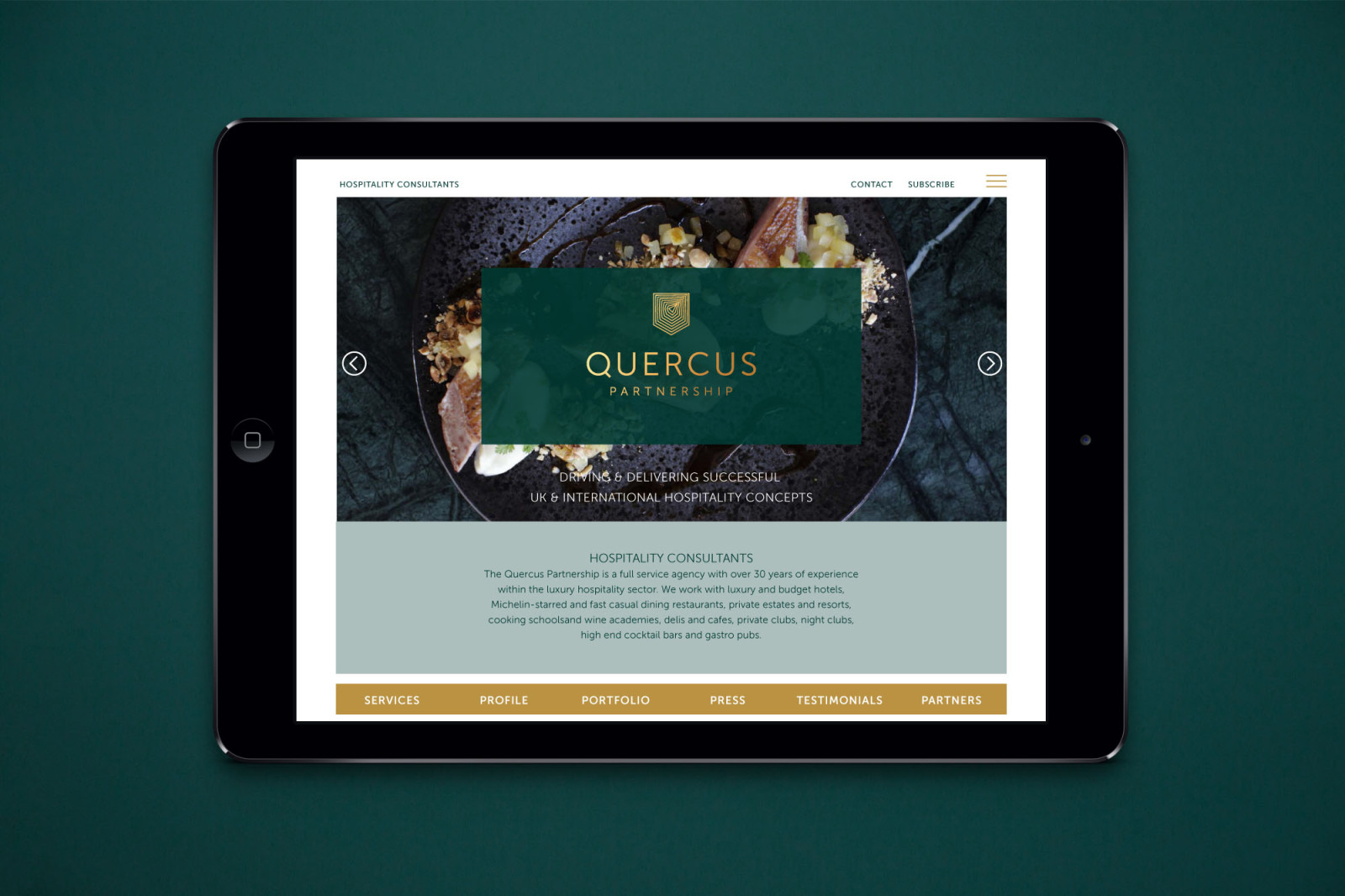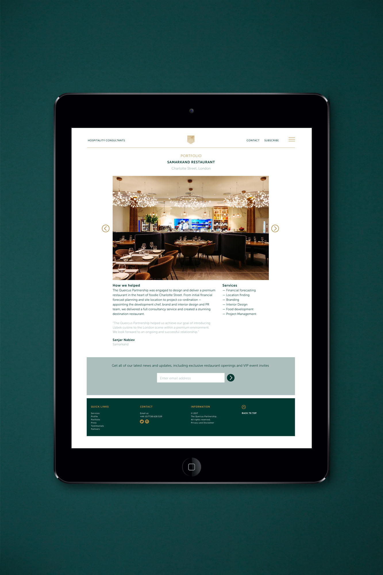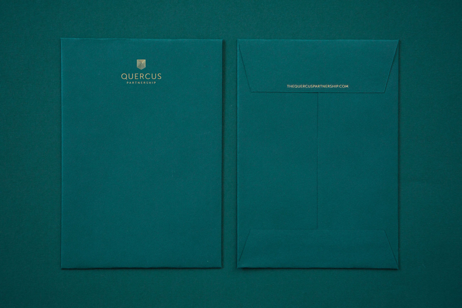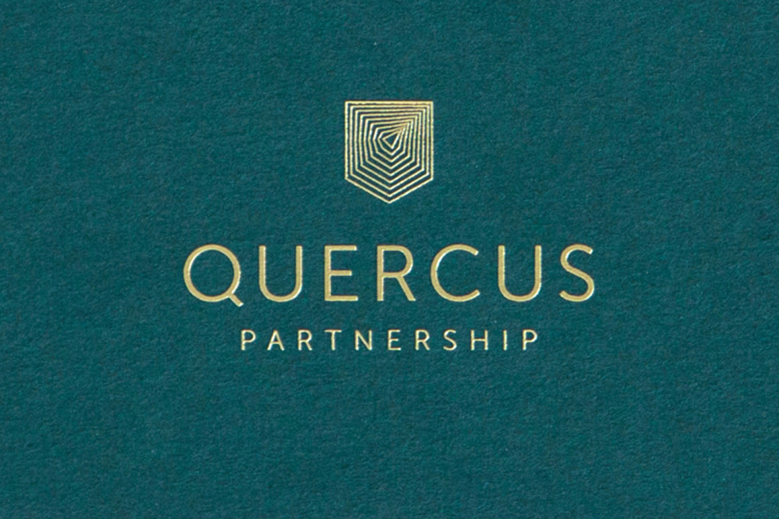
Branding project for well respected hospitality consultants. Quercus is latin for Oak and our brief was to create a brand that expressed great experience, trust and solidity. The colour palette consists of traditional racing green and gold and the logo is a combination of a shield motif and an interpretation of the age rings found within an oak tree.