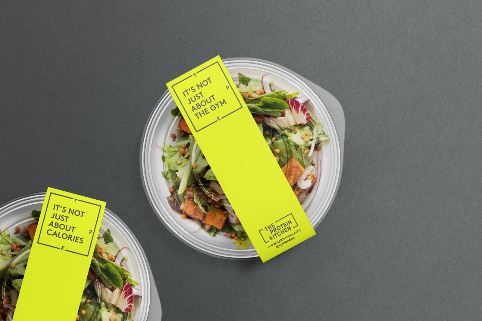
Fast-casual concept focused on those looking for personalised luncjes to fit within their health regimes. Green is often used to denote health brands but we turned up the volume, applying a vibrant flouro to represent TPK’s enthusiasm and positive energy. The brand language playfully employs a healthy and balanced outlook
![](https://busbywebb.co.uk/storage/uploads/2024/02/c729eee5a065c768f7c93c14ed98a70b.gif)
![](https://busbywebb.co.uk/cache/image/large/2024/02/767c6dd0a4c68121618d97d3eec4468e.jpg)
![](https://busbywebb.co.uk/cache/image/large/2024/02/3ef7022a8f6b421a44f51753d929561f.jpg)
![](https://busbywebb.co.uk/storage/uploads/2024/02/918b0140ed3a8fb4c54402d9130c7ad8.gif)
![](https://busbywebb.co.uk/cache/image/large/2024/02/b0df176ed1560593142ef8cf39a511dd.jpg)
![](https://busbywebb.co.uk/cache/image/large/2024/02/eb23a892bb6891310113d28017593c40.jpg)
![](https://busbywebb.co.uk/cache/image/large/2024/02/d9481e701eae357bbacd570b7c001986.jpg)
![](https://busbywebb.co.uk/cache/image/large/2024/02/456d9f4f66d4ec8d91dfe4d86da48ea9.jpg)
![](https://busbywebb.co.uk/cache/image/large/2024/02/e4a0cb35881136b6226b1800569be30b.jpg)